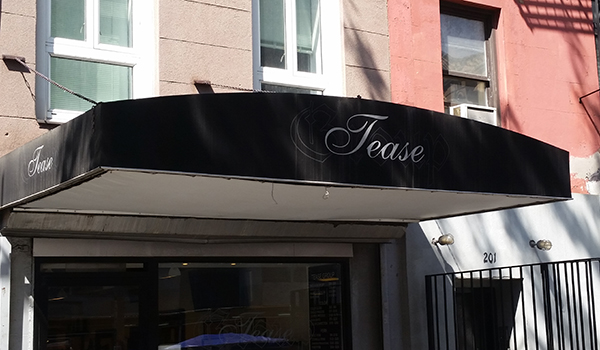
Category Archives: Visual Language

Color Composition

My plans for this one changed. At first I thought, let me create something in p5 that lets the user move a “lens” in the image that turns drab circles bright, a la the polarized mural in the Museum of Science in Boston, one of the touchstones of my childhood. But then I started to think about what it would actually look like, and it interested me less.

Then I thought, maybe I need to create a tetrahedron that can rotate, and the angle of the plane to the viewer creates the “thickness” of the glass, which in turn determines the intensity of the color… and that sounds lovely, but is way beyond my programming abilities at the moment.

And then I just started sketching.

A couple of years ago, I was out one day running errands with a dear friend, the very brilliant artist Zefrey Throwell, and I was engaging in a favorite annoying pastime, kvetching about the vacuousness of the New York art scene, and of contemporary art in general. And he brought up Richard Tuttle, whose work I was unfamiliar with, and what Zefrey described as the central question of his artmaking: “why is this not nothing?” This thing, next to that thing, in this place – why is this not nothing? I’m not sure it’s always a valid defense, but it’s a thought-provoking question, and one that has stuck with me ever since.

I love to draw, though it’s not a medium I’ve ever made much out of. I draw for pleasure, and to play with ideas, and out of boredom, and sometimes to surprise myself.

I got out a pencil and a ruler, drew a line, then pulled the ruler ever so slightly back, drew another line, and said to myself, “I’m drawing a square.” The rule was, don’t intentionally deviate from parallel, but if you do, try to compensate in the next line. Same goes for top and bottom edges.

Sketch

And then I scanned it and started to play with colors, and I have to admit my favorite version is the red and blue, originally just a placeholder for other colors, but I think there’s something weirdly compelling about it.

It’s not nothing. But only just.

Hue

Hue2

Saturation

Brightness


Strictly Business (Cards)

I am, at heart, a conservative, a formalist and a curmudgeon.

I remember, in childhood, that I thought having a business card meant something serious about you. The only people I encountered who had business cards were professionals, and the cards all looked basically the same. You could have any color you wanted, as long as it was somewhere between white and ivory. Black thermographic ink. And your choice of Bank Gothic, Copperplate or a couple of classic serif typefaces.

When I was thirteen, my first band, The Inbreds, booked its first show, in the garage of some punk house in New Brunswick, NJ. Our lead singer’s mom and stepdad drove us down from Boston, and there were all these older punks (21? 23? Ancient!) milling around and drinking beer from a keg. I was talking to one pierced, tattooed fellow, and when we parted, he pulled out his card and handed it to me. It looked like every other business card I had ever seen, but it said:

Angel Serrano

Skinhead

Blew my mind.

And then the internet happened and all of a sudden everyone had a snazzy, thoroughly-designed business card, something really personal that really spoke to the bearer’s personality. 4/4? No prob! Foil stamping? Groovy! Three-panel foldout? Now you’re talking. And in all fairness, I too have a snazzy, well-branded business card, handsomely printed on thick stock by Moo.com.

But I miss the old form, in my curmudgeonly heart.

So for the purposes of this class, my business card is:

BizCardFrontFLAT

Printed on Hahnemuhle Copperplate that someone was kind enough to leave a few sheets of in my possession. Thick enough to serve as a card, soft enough to travel through an inkjet printer.

And on the back is an original artwork that I have decided to call “Guinea Pig Fantasia No. 1.”

BizCardBackFLAT

Logos!

black-flag-logo-650

Raymond Pettibon, 1978

I can’t really think of a better logo than Black Flag’s. Iconic (in both senses of the term), instantly recognizable, easily reproducible, it looks great spraypainted on a wall, inked on the back of an eighth-grade notebook, tattooed on a bicep or printed “properly” on a record cover. Mess up the dimensions? Who cares?! One bar is a little wider than the others? Nobody notices! Just make sure there are four vertical rectangles, and nos. 2 and 4 are a little lower than 1 and 3. That’s Black Flag.

And now for my logo:

I actually already sort of have two logos. One is an insignia for my company:EGInsig

and the other is a little more abstract:

BunnyLogo

I really like both of them, but they’re more for my business than they are for myself. So I’d like to design a logo just for me that fits with my current “branding.” Jared Friedman: another great product from the company that brought you Econo Graphics. Etc. etc.

Anyway, my first step was to think about what elements make up my visual identity. I am first and foremost a printer, and tend to emphasize specific print elements in my work. So halftone dots: check.

Much of the work I’ve done lately involves screen printed color photographs, so I’ve spent a lot of time thinking about CMYK and its possibilities and limitations. Cyan, magenta and yellow are a good palette starter.

The body of work that brought me to ITP was based on geodesic domes, so those would also be a good motif.

And lastly, my personal aesthetic tends to veer towards punk rock, so bright colors against black and grey.

I put these hallmarks and influences in a blender and started sketching. (I should say “sketching,” as I was using Photoshop and not pen and paper to play with everything).

My first thought was maybe to do something with my initials, in Bodoni Fat Face. This is what I came up with:

InitialsLogo2

I really like the interplay of the colors and shapes, and it captures the sense of recombining a very small number of elements to create many more possibilities. But while I love type, I’m not a type obsessive. And using only CMY speaks to a sort of design rigidity that I’m fond of but don’t really exhibit in my own work. So I like it, but it’s not quite “me.”

Then I turned to the geodesic dome idea. I thought, maybe the abstract shape of the dome could provide some simple visual motif around which to coalesce. I took a very basic visualization I had been working with, and started manipulating it.

I came up with one piece of design that I really liked, but which was way too complicated to be a logo:

DomeScratch1

And then a couple of things that looked like catchy templates for business cards:

DomeScratch2 DomeScratch3

Fine-looking, if a bit corporate, but definitely not logos.

Then I started to think about people, not businesses, who had logos of one sort or another, and the ones that came immediately to mind were Che Guevara and J.R. “Bob” Dobbs. And I started to think of how much I liked my bunny logo. So I decided to try and combine those two ideas, and I think I’m happy with the result.

I began by taking a rather unflattering picture of my face and halftoning it at a very coarse line count. I then rendered it almost exactly as I did the bunny (single-color halftone over white on contrasting color field), only using the bright color as the background and not the halftone. Lastly, I tried to give it a little zip by removing the properly registered white layer and replacing it with a fairly clean scribble (I tried using a scanned real scribble and it was way too much chaos). And lastly I chose an eye-aching orange to compliment the pink of the bunny.

Here it is:

FaceLogoFINAL

It’s me!!


Typecasting

Typeface #1: Souvenir

JFSouv

Souvenir is an unfashionable font. Nobody has set anything they cared about in Souvenir in three decades. It has wide polyester lapels, big sideburns, and it comes upholstered in a coordinated range of earth tones. But on its own merits it’s a nice typeface, very friendly, not impressed with itself, and even rather fresh-looking after its long stay in the attic. I say it deserves to come back.

Typeface #2: Ad Lib

JFAdLib

When I was in sixth grade, my family’s dot matrix printer died and I managed to convince my mom to buy a laser printer. And a bargain-bin floppy disk called something like “1001 Fonts.” It was better than any computer game I’d ever played. All of a sudden, the formerly workmanlike world of computerized  lettering was a sea of possibilities. And I got yelled at by my teacher for turning in my book reports (~2 double-spaced pages) printed entirely in Ad Lib on day-glo orange paper.

Typeface #3: Avant Garde

JFAvant

Another childhood memory, this time of making signs by rubbing transfer lettering off its plastic sheet onto posterboard. For some reason in my memory it was always Avant Garde, and I remember being fascinated by the alternate character forms (weird sloping A’s, wild ligatures) and the capital “R” with the disconnected bar.

Typeface #4: Mrs. Eaves

JFEaves

Elegant, tasteful contemporary riff on Baskerville designed in 1996 by the brilliant Zuzana Licko. I fell in love with it the first time it was brought to my attention, though now I have to say it’s beginning to look a little bit dated – a very late-90s/early 2000s feel. Still, it’s pretty. Really pretty.

Typeface #5: Cooper Black

JFCooper2

Peanuts. Summer camp. Iron-on-flock-lettered t-shirts. Iconic, instantly recognizable, yet not overused. Maybe my all-time favorite titling type.

Typeface #6: Modern Alphabet for Display

JFDec

The first graphic design work I ever did was designing posters for my band and friends’ bands. I became obsessed with the idea that the more that lettering looked like a computer font, the less cool it was, so I would search out old lettering manuals, type catalogs and even just regular-old books, scan the letters and string them together with Photoshop. This was one of my favorite random finds, from a book called “Alphabets Ancient & Modern,” published in 1945.

And the whole bunch together:

NameTextMASTER

Expressive words:

Annoyance


Prey


PunkRock


It’s a sign!!

TeaseMaster

This is a bad sign.

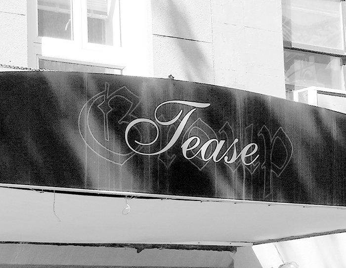
Passing this business, I couldn’t imagine what it might be, though I assumed that whatever it was, it was lurid.

Upon closer inspection (peeking in the window), I discovered two things:

1) It’s actually a hair salon

2) The name of the establishment is not “Tease” but “Tease Group” (which is truly not much more informative)

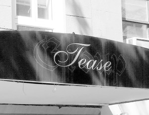
But looking at the awning, I got none of that. After a couple of moments, I realized the sign actually does say “Tease Group.” It’s just that “Group” is behind “Tease” (which means it really reads “Group Tease,” which is awful), and in a dark grey fine-outline blackletter gothic , so that it’s virtually impossible to see, let alone read (or perhaps that’s the tease they’re talking about). I have futzed with it in Photoshop to illuminate:

TeaseLEVELS

So, ugh.

This one might be a stretch, given that it’s an advertisement and not strictly a sign, but it still means to convey information and does it very badly:

DeliveryAd

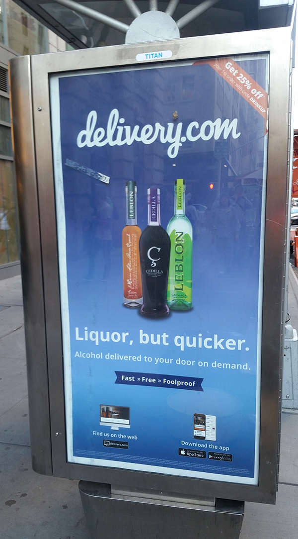
After staring at this one for a little while, I realized it was announcing that delivery.com now delivers booze. Which is useful, undoubtedly. But there is such chaos of information that I never would have gathered that if I hadn’t stared at it for an unusual amount of time, and I wouldn’t have stared at it at all if I hadn’t been on the hunt for bad signage.

Where to begin? Is it the ugliness, the dullness or the unreadability that makes it stand out?

I guess the most notable thing is that it seems to be missing a foreground – like everything it presents is a few steps down the hierarchy with nothing to grab your attention (or even tell you where to place your eye). The first thing you see (I guess) is a too-small picture of three bottles of something not very recognizable. Then the rather uninformative legend “Liquor, but quicker,” in Calibri Bold (!), which at least tells you that the bottles you’re looking at contain alcohol. Then the strangely unreadable “delivery.com” logo way at the top, and then everything else is too small, too ugly and/or too wordy to read. And the little illustrations of “the web” and “the app store” don’t help at all.

Plus it’s drowning in a sea of Windows 3.1 blue-gradient. It isn’t so much a hot mess as a lukewarm mess. Which is somehow worse.

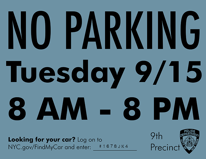
I hate this sign perhaps more than any other I see on a regular basis in New York City:

NoParking

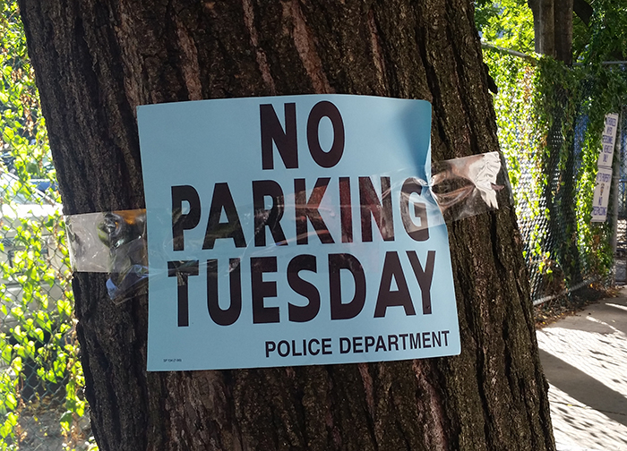
This sign is a laconic masterpiece of very consequential non-information. It is the visual equivalent of a conversation with an obstinate police officer. Some thoughts I’ve had when seeing this sign:

1) Which Tuesday? This Tuesday? Last Tuesday and nobody bothered to take it down? Possibly next Tuesday and someone got a little eager?

2) What time Tuesday? Like if I’m coming home late Monday night, can I park at 1 AM? How about 7 AM, running in to the deli to grab coffee? Or it’s the middle of Tuesday afternoon and clearly nothing’s happening, so is what you needed this space for over, or has it not begun yet?

3) What will happen to my car if I do park here Tuesday?

And I’ve seen this sign enough to know that it’s a New York thing, but if I were from out of town, I’d be deeply skeptical of that “POLICE DEPARTMENT” at the bottom. It looks about as unofficial as it gets.

So here’s how I’d improve it:

BetterParkingSign2

Still not going to win any awards for aesthetics, but the relevant information is all pretty visible, and the finer details are there if you want or need to inspect closely (like, say you went away for the week and came back to find this sign instead of your vehicle). This design also supposes that the city might track towing using a stamp system linked to whatever project parking is being prohibited for, to enable people to find their cars more easily.

And now a good one.

Endy

Admittedly this sign doesn’t convey much information – “there’s a Wendy’s here” pretty much sums it up. But it wins for evocative aesthetics, and moreso for illustrating how iconic good logos are. It doesn’t need the first or last letter to get its message across – that type and palette are so clearly Wendy’s that I’d imagine they could get away with two more letters being out. In fact, let’s try it:

EndyMOD

Yup. Still works.

20 Jazz Funk Greats


20JFG1

This is perhaps my favorite record cover of all time.

The hierarchy of information begins with the title: 20 Jazz Funk Greats. Pretty self-explanatory, and in a far-out heavily chiseled and drop-shadowed Wide Latin that looks like mid-sixties party time.

Then we move on to the images of the musicians. Four well-adjusted-looking young people, standing in a field of flowers, somewhere at the coast. Swinging-London minidress, white blazer, open collar and high-waisted bell-bottoms, sensible sweater and tan chinos, turtleneck and pageboy haircut… we know these guys. Fashionable but not outlandish. With-it. Groovy. And they’re looking right at the camera and smiling, so you know they’re sincere, and that they like you.

The next piece of information is the name of the band, “Throbbing Gristle.” That one doesn’t fit so well, but since it’s the most boring piece of visual information (small, basic sans-serif that almost screams “legal boilerplate”) on the cover, our eyes quickly move to an effervescent “bring you” in breathy brush script, which gets us right back into a bygone era.

And then “Stereo,” in a curvy custom-looking italic where the ends of the “S” almost look like headphones.

It’s all laid out on a very classic, very symmetrical grid, most of the important business taking place above the upper third line, the people spaced regularly from left to right, staggered back to front to avoid monotony.

20JFGgrid

And all of these elements are tied up in an overall visual package that is pitch-perfect sixties.

20JFGpalette

From the layout (full frame photo, font-salad text above the subjects’ heads) to the image quality of the picture (high contrast, limited over-saturated palette, weird skin tones), every inch of it makes it look  like the cousin of these:

PPM 4Seasons Herb

A bargain-bin find (“Honey? You ever heard of this band, ‘Throbbing Gristle’?”) that could be earnest folk, or might be mellow moods, but is sure to soothe your ears in one way or another.

What it doesn’t look like is what it is, which is one of the most abrasive and alienating chunks of music ever committed to tape:

https://www.youtube.com/watch?v=BHvhtv42ACE

It’s not from the sixties. It’s not jazz. It’s not funk. There aren’t even twenty songs on it.

The cover works on the viewer/listener in two ways. First, ostensibly to entice an unsuspecting consumer into buying it, taking it home and getting a nasty shock.

But also (and, I would argue, more powerfully) it serves to contextualize the music as not only a strident but an intimate assault on mainstream culture. The design observes the straight world so creepily closely that it amplifies the inversion into something like a vendetta. “We know you,” they seem to say. “We are you.” Or maybe “we have been you.”

And at the same time it’s a beacon to listeners who themselves feel alienated from the culture it portrays – I would say “teenagers,” but it still resonates with me, even long after I first heard it and long after I cut my hair and got a job.  It’s for when you’re stuck in a meeting, or on the subway, or listening to pompous political cant, surrounded by advertising and frustration and noise. It’s noise too, of course. But an invigorating kind of noise.