![]()
Raymond Pettibon, 1978
I can’t really think of a better logo than Black Flag’s. Iconic (in both senses of the term), instantly recognizable, easily reproducible, it looks great spraypainted on a wall, inked on the back of an eighth-grade notebook, tattooed on a bicep or printed “properly” on a record cover. Mess up the dimensions? Who cares?! One bar is a little wider than the others? Nobody notices! Just make sure there are four vertical rectangles, and nos. 2 and 4 are a little lower than 1 and 3. That’s Black Flag.
And now for my logo:
I actually already sort of have two logos. One is an insignia for my company: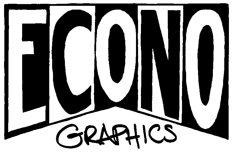
and the other is a little more abstract:
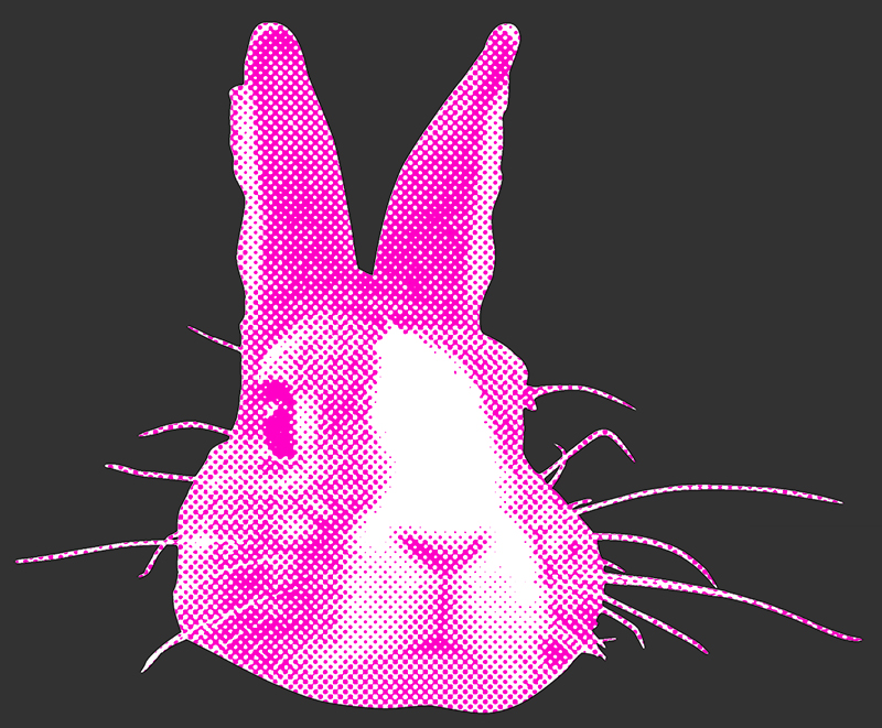
I really like both of them, but they’re more for my business than they are for myself. So I’d like to design a logo just for me that fits with my current “branding.” Jared Friedman: another great product from the company that brought you Econo Graphics. Etc. etc.
Anyway, my first step was to think about what elements make up my visual identity. I am first and foremost a printer, and tend to emphasize specific print elements in my work. So halftone dots: check.
Much of the work I’ve done lately involves screen printed color photographs, so I’ve spent a lot of time thinking about CMYK and its possibilities and limitations. Cyan, magenta and yellow are a good palette starter.
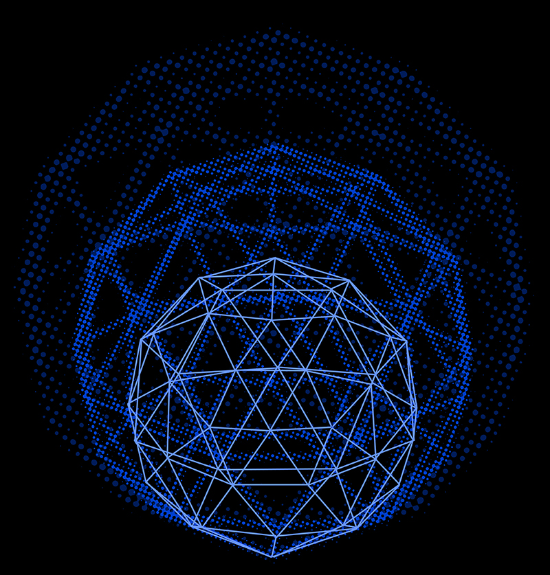
The body of work that brought me to ITP was based on geodesic domes, so those would also be a good motif.
And lastly, my personal aesthetic tends to veer towards punk rock, so bright colors against black and grey.
I put these hallmarks and influences in a blender and started sketching. (I should say “sketching,” as I was using Photoshop and not pen and paper to play with everything).
My first thought was maybe to do something with my initials, in Bodoni Fat Face. This is what I came up with:
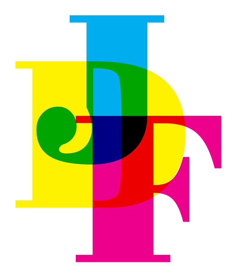
I really like the interplay of the colors and shapes, and it captures the sense of recombining a very small number of elements to create many more possibilities. But while I love type, I’m not a type obsessive. And using only CMY speaks to a sort of design rigidity that I’m fond of but don’t really exhibit in my own work. So I like it, but it’s not quite “me.”
Then I turned to the geodesic dome idea. I thought, maybe the abstract shape of the dome could provide some simple visual motif around which to coalesce. I took a very basic visualization I had been working with, and started manipulating it.
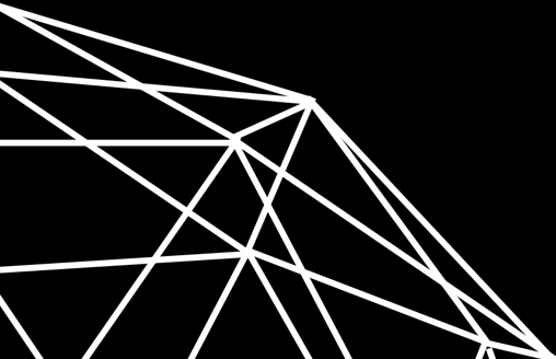
I came up with one piece of design that I really liked, but which was way too complicated to be a logo:
And then a couple of things that looked like catchy templates for business cards:
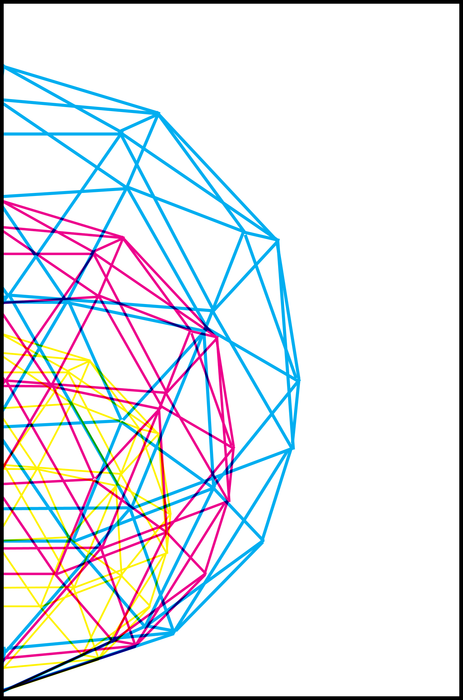
Fine-looking, if a bit corporate, but definitely not logos.
Then I started to think about people, not businesses, who had logos of one sort or another, and the ones that came immediately to mind were Che Guevara and J.R. “Bob” Dobbs. And I started to think of how much I liked my bunny logo. So I decided to try and combine those two ideas, and I think I’m happy with the result.
I began by taking a rather unflattering picture of my face and halftoning it at a very coarse line count. I then rendered it almost exactly as I did the bunny (single-color halftone over white on contrasting color field), only using the bright color as the background and not the halftone. Lastly, I tried to give it a little zip by removing the properly registered white layer and replacing it with a fairly clean scribble (I tried using a scanned real scribble and it was way too much chaos). And lastly I chose an eye-aching orange to compliment the pink of the bunny.
Here it is:
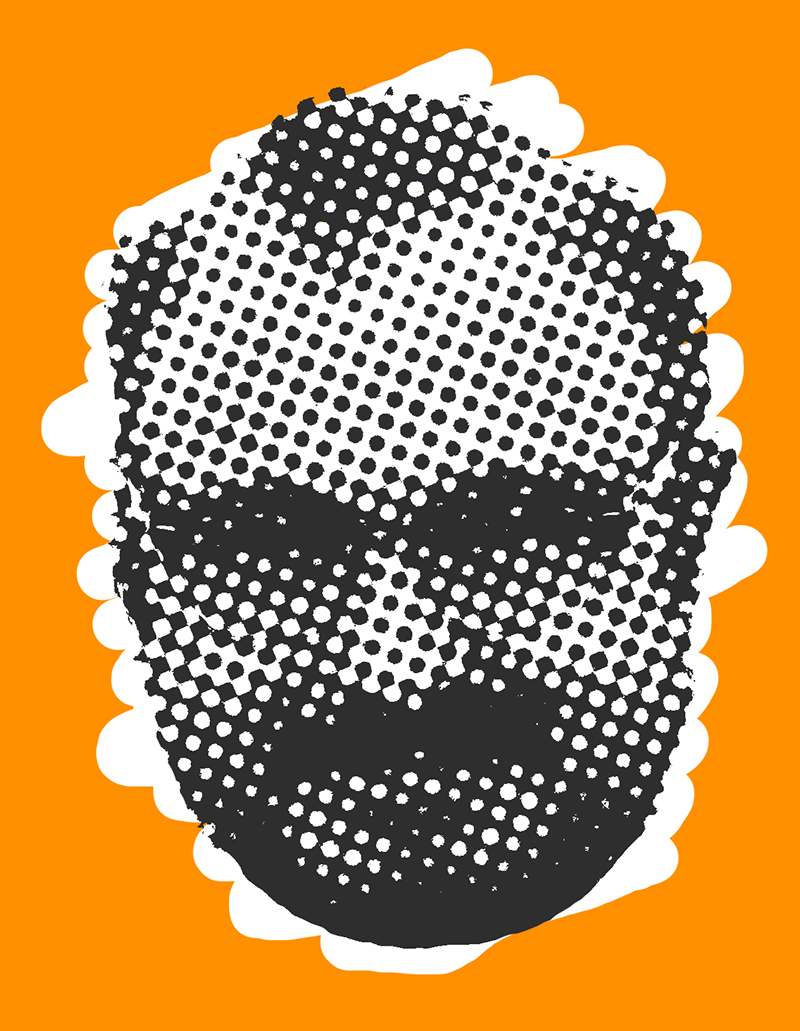
It’s me!!