Monthly Archives: September 2015

Observation: Subway Kiosks

KioskHeader

The MTA’s subway information system (the “On the Go Travel Station”) tests the negative limit of what might be described as interactive. I hadn’t actually tried to use one before doing this observation, but in the interest of science, I walked up to one and touched its enormous and rather lovely screen.

The available options are very few, especially when compared with how the machine looks – new and nicely built, with good graphics, you expect it to be able to tell you anything you might want to know about the subway system, say perhaps the contents of the MTA’s website (full train schedules, bus info, upcoming planned service interruptions, etc.), retooled for the kiosk interface. But no. The kiosks (at Union Square, at least) give you precisely three possibilities – a map that gives you train information for the quickest way to your destination (either another subway station or one of a preset menu of points of interest):

KioskLineMap

a list of current service interruptions affecting the lines running through this particular station (but as far as I could tell, only lines running through this station):

KioskSvcChange

and a guide to elevators and escalators in the station. Additionally, there’s a pretty good local street map that opens if you click on the “i” icon over Union Square on the map that figures out quick train routes, but nothing that tells you that that will happen, and nothing that points you towards it if you’re looking for it.

KioskStMap

That’s very limited functionality for what these machines must have cost, and it showed on the faces of most of the people I saw using one. They would walk up, start pressing buttons, stand there certain they must be missing something, and then walk away.

When the machine is resting normally (i.e. nobody is using it) it displays advertising, and a helpful fourth function, a list of arrival times for the trains in the station. I believe it takes schedule data (the header of the list says “scheduled arrival times”) rather than real-time information, but that makes sense since only a relatively few lines have that capability so far.

Unfortunately there’s no way to actually call that screen up if you want to see it. Normally not a problem as it displays on rotation with the ads, but when there’s a service interruption, it replaces the resting screen with a solid service advisory screen:

KioskSvcAdv

with the consequence that now there’s no way to see the scheduled trains for the station. And the four functions become three once again…

But it was very interesting to watch actual humans try to interact with the machine. I noticed that a few people pulled up information they wanted and then pulled out their phones to take pictures. Mostly, though, it was just people scrolling through again and again, looking for something that wasn’t there.

I’m not sure if this limitation is just the first phase and they have plans and capabilities to add more features as the program rolls out, but the kiosks have been up for nearly two years now. It’s mystifying that they give less information than the platform bulletin boards do, but they are pretty to look at.


Logos!

black-flag-logo-650

Raymond Pettibon, 1978

I can’t really think of a better logo than Black Flag’s. Iconic (in both senses of the term), instantly recognizable, easily reproducible, it looks great spraypainted on a wall, inked on the back of an eighth-grade notebook, tattooed on a bicep or printed “properly” on a record cover. Mess up the dimensions? Who cares?! One bar is a little wider than the others? Nobody notices! Just make sure there are four vertical rectangles, and nos. 2 and 4 are a little lower than 1 and 3. That’s Black Flag.

And now for my logo:

I actually already sort of have two logos. One is an insignia for my company:EGInsig

and the other is a little more abstract:

BunnyLogo

I really like both of them, but they’re more for my business than they are for myself. So I’d like to design a logo just for me that fits with my current “branding.” Jared Friedman: another great product from the company that brought you Econo Graphics. Etc. etc.

Anyway, my first step was to think about what elements make up my visual identity. I am first and foremost a printer, and tend to emphasize specific print elements in my work. So halftone dots: check.

Much of the work I’ve done lately involves screen printed color photographs, so I’ve spent a lot of time thinking about CMYK and its possibilities and limitations. Cyan, magenta and yellow are a good palette starter.

The body of work that brought me to ITP was based on geodesic domes, so those would also be a good motif.

And lastly, my personal aesthetic tends to veer towards punk rock, so bright colors against black and grey.

I put these hallmarks and influences in a blender and started sketching. (I should say “sketching,” as I was using Photoshop and not pen and paper to play with everything).

My first thought was maybe to do something with my initials, in Bodoni Fat Face. This is what I came up with:

InitialsLogo2

I really like the interplay of the colors and shapes, and it captures the sense of recombining a very small number of elements to create many more possibilities. But while I love type, I’m not a type obsessive. And using only CMY speaks to a sort of design rigidity that I’m fond of but don’t really exhibit in my own work. So I like it, but it’s not quite “me.”

Then I turned to the geodesic dome idea. I thought, maybe the abstract shape of the dome could provide some simple visual motif around which to coalesce. I took a very basic visualization I had been working with, and started manipulating it.

I came up with one piece of design that I really liked, but which was way too complicated to be a logo:

DomeScratch1

And then a couple of things that looked like catchy templates for business cards:

DomeScratch2 DomeScratch3

Fine-looking, if a bit corporate, but definitely not logos.

Then I started to think about people, not businesses, who had logos of one sort or another, and the ones that came immediately to mind were Che Guevara and J.R. “Bob” Dobbs. And I started to think of how much I liked my bunny logo. So I decided to try and combine those two ideas, and I think I’m happy with the result.

I began by taking a rather unflattering picture of my face and halftoning it at a very coarse line count. I then rendered it almost exactly as I did the bunny (single-color halftone over white on contrasting color field), only using the bright color as the background and not the halftone. Lastly, I tried to give it a little zip by removing the properly registered white layer and replacing it with a fairly clean scribble (I tried using a scanned real scribble and it was way too much chaos). And lastly I chose an eye-aching orange to compliment the pink of the bunny.

Here it is:

FaceLogoFINAL

It’s me!!


Small-Game Hunting in the Technological Junkyard

Or, I fought the machine, and the machine (has, temporarily) won.

In casting about for a good project using the Arduino’s analog outputs, I started letting my mind wander to one of its favorite pseudo-Luddite dwelling places, the thought that there are now generations upon generations of technology that we have abandoned as obsolete, but that have some unique traits that might be worth resurrecting, or, less pompously, that might be fun to play with. I decided the thing I wanted to do was to find an old machine, open it up, tweak it with the Arduino and make new life in the old shell.

And almost immediately the idea of the cassette deck became lodged in my head – an iconic piece of cultural technology that iterated through dictation, to “home taping is killing music,” to the Walkman, then to nothingness, replaced at every stage by more efficient digital methods.

I started thinking what I might do with a cassette deck. My mind wandered back to the awful racket of our Arduino sound experiment, with square waves of pure tone, and I started to think that one of the nice things about cassettes was that though they were noisy (hiss, flutter, wow) and not always very faithful, it was a smelly, dirty, human sort of noise, not the coldly rational death-blare of unmodified PWM. And I thought, let me make an analog synthesizer out of a cassette deck.

I looked around for an old Walkman, but after visiting several thrift stores, junk shops and antique stores, I couldn’t for the life of me find one. And then I walked into a 99 cent store, and sitting up at the top of the display behind the cash register was a Coby microcassette recorder in its original, now very yellowed, blister pack. I bought it (to the store owner’s tremendous surprise) and took it home.

My plan was fairly simple – I would record a simple tone using an online tone generator and the onboard microphone, and then modify the pitch by changing the tape speed, using the Arduino as power supply at as non-invasive a stage as would work.

And then I ran into my first snag. I popped in some batteries, put in the microcassette, hit play and record, and spoke into the microphone – “testing, testing.” And when I played it back, I got garbled nonsense.

I checked the batteries – 1.61 volts each. And then I plugged in a universal AC adapter, and got the same results as before – inconsistent speed, occasionally stopping completely, then going again.

But at this point it was too late to get another tape player through eBay, and besides, I had even less hesitation now about busting the thing open to get at its guts. I unscrewed the five visible screws, used my wire cutters to shear away the pieces of the plastic housing that were fixed to the board, and pulled out the circuitry and mechanism.

MCMechMCCirc

I wondered if there was perhaps something funky between the batteries and the motor making the motor run oddly, so I found the motor’s leads and put 3V across them ( the smallest charge my power supply could deliver) – it sounded very smooth. I turned it over, and realized that though the motor was turning fine, the spindle was not, even though I had the “play” button (or what was left of it) engaged. I looked closer, and saw that the tiny drive belt running from the motor to the spindles was moving chaotically, and that seemed to be the problem. If I had to guess, I would say that whatever processes of heat and moisture, up by the ceiling of the 99 cent store, that had yellowed the packaging, had also degraded the plastic in the drive belt and/or the spindle’s gears to the point that it no longer worked. Or perhaps it was just a lemon to begin with.

But I also noticed that “rewind” worked fine. And by a lovely engineering quirk of the microcassette recorder genre, it was theoretically still possible to play back in rewind mode. I decided to go ahead with the project and just give it a shot.

My plan then was to disconnect the motor from the rest of the circuit board and farm out control of that to the analog outputs of the Arduino. At the same time, I would power the rest of the circuitry (sound output) using the digital outputs of the Arduino. I would change the tone by modifying the speed of the motor (first experimenting to see what output number corresponded with what pitch) and allow rhythmic elements in by turning the circuitry on and off. Of course this posited that I would be able to run it well enough to record some tone onto the tape, but that seemed a secondary concern.

I got out my soldering iron, disconnected the motor, and soldered some non-tiny wires onto the ends of the leads. I then measured the resistance across the motor using a multimeter and soldered a fixed resistor of roughly similar rating to compensate for whatever power the motor might have drawn from the circuit. I soldered the speaker wires back to the internal speaker (they got disconnected in the great breaking-apart) and then ran 3V across the battery leads. A faint hum came through the speakers. I engaged the record head. The on-board LED came on!

Then I put the microcassette into its place, took my voltage and put it across the motor. The motor turned. I pressed “play.” Nothing happened. The drive mechanism had completely failed.

So I have essentially nothing to show for this project, though I think I am going to go ahead and order a couple of Walkmen off eBay, as they’re pretty inexpensive at this point, and I still think the idea is worth exploring. My hope is to begin by making a simple monotone synthesizer from one machine, and then try to gang together several to make a small “orchestra”. And of course, if I can get it to work correctly, the possibilities for both input (sensors, knobs, human interactions in general, as opposed to lines of code) and output (speech, ambient noise, instrument sounds as opposed to pure tone) are pretty exciting.

So watch this space!


Typecasting

Typeface #1: Souvenir

JFSouv

Souvenir is an unfashionable font. Nobody has set anything they cared about in Souvenir in three decades. It has wide polyester lapels, big sideburns, and it comes upholstered in a coordinated range of earth tones. But on its own merits it’s a nice typeface, very friendly, not impressed with itself, and even rather fresh-looking after its long stay in the attic. I say it deserves to come back.

Typeface #2: Ad Lib

JFAdLib

When I was in sixth grade, my family’s dot matrix printer died and I managed to convince my mom to buy a laser printer. And a bargain-bin floppy disk called something like “1001 Fonts.” It was better than any computer game I’d ever played. All of a sudden, the formerly workmanlike world of computerized  lettering was a sea of possibilities. And I got yelled at by my teacher for turning in my book reports (~2 double-spaced pages) printed entirely in Ad Lib on day-glo orange paper.

Typeface #3: Avant Garde

JFAvant

Another childhood memory, this time of making signs by rubbing transfer lettering off its plastic sheet onto posterboard. For some reason in my memory it was always Avant Garde, and I remember being fascinated by the alternate character forms (weird sloping A’s, wild ligatures) and the capital “R” with the disconnected bar.

Typeface #4: Mrs. Eaves

JFEaves

Elegant, tasteful contemporary riff on Baskerville designed in 1996 by the brilliant Zuzana Licko. I fell in love with it the first time it was brought to my attention, though now I have to say it’s beginning to look a little bit dated – a very late-90s/early 2000s feel. Still, it’s pretty. Really pretty.

Typeface #5: Cooper Black

JFCooper2

Peanuts. Summer camp. Iron-on-flock-lettered t-shirts. Iconic, instantly recognizable, yet not overused. Maybe my all-time favorite titling type.

Typeface #6: Modern Alphabet for Display

JFDec

The first graphic design work I ever did was designing posters for my band and friends’ bands. I became obsessed with the idea that the more that lettering looked like a computer font, the less cool it was, so I would search out old lettering manuals, type catalogs and even just regular-old books, scan the letters and string them together with Photoshop. This was one of my favorite random finds, from a book called “Alphabets Ancient & Modern,” published in 1945.

And the whole bunch together:

NameTextMASTER

Expressive words:

Annoyance


Prey


PunkRock


Test Your Self-Awareness!

My project is a machine that tests not your strength per se, but your strength compared to how strong you think you are, hence the accuracy of your self-image.

It consists of three parts – an input device that you grip with your hand:

2015-09-22 01.20.50

A dial (potentiometer) to set the sensitivity of the machine:

2015-09-22 01.21.24

And a display to show you how well you did:

2015-09-22 01.21.38

I began work by just plugging in the flex sensor (in series with a 10-kilohm fixed resistor) and bending it as far as I could to see the range of values it returned (having written a program to send those values to the serial monitor). I then taped it to the grip, and made sure that I really could translate the action of the grip into a reliable-ish reading from the flex sensor. Blessedly, it worked. The only issue was a little bit of noise – the numbers would fluctuate a few points seemingly without much of a physical change to the sensor.

I then tried to write a program that would smooth out the noise, recognize an actual squeeze to the device, and hold the most extreme value for a short while. I realized that I had to measure the current reading against the last (a moment ago) reading, then set a timer when numbers started going back up (more than the few points of the noise, i.e. the squeeze was over), then reset all values for the next attempt.

I set a range of values going from what I considered a modest squeeze up to the strongest I could muster (interestingly, the weak squeeze was still more than halfway from no-squeeze to total compression). I set a different-colored LED for each possible value, along with the RGB LED that came with the Arduino kit to light up the “title” of the display.

2015-09-20 21.52.41

Next I added the potentiometer to the mix. My first inclination was to simply multiply the flex sensor input by a fixed fraction plus some minute fraction of the reading from the potentiometer (eg potValue/5120, to make something between 0 and .2), but when I tried it, the results were very, very strange. I opened up the serial monitor, looked at all my numbers, and quickly realized that the figures relying on the pot were not moving according to any discernible logic. I surmised (and this is still just a guess) that I was getting outside the edges of the Arduino’s math abilities, and that it didn’t like trying to shoehorn values around 1000 into a range of less than .2. I changed the numbers to multiply the sensor input by 10 and add the pot value more or less straight, and that worked like a charm.

I rummaged through the cardboard and paper recycling for housing that might fit my components, and was very happy to find the box from a bar of soap for the dial (not Dial soap, sadly) and a LU cookie box for the display.

2015-09-22 00.20.52

And lastly I created the skins for the dial and the readout in Photoshop, printed them out, and taped them in the appropriate places.

And then I tested my self-awareness!

Code:

const int flexSensor = A0;
const int potInput = A5;
const int blueRGB = 3;
const int greenRGB = 5;
const int redRGB = 6;
const int blueLED = 8;
const int greenLED = 9;
const int whiteLED = 10;
const int yellowLED = 12;
const int redLED = 13;

int flex = 0;
int a = 1000;
int b = 1000;
int c = 1000;
int base = 1;
int r = 1;
int y = 1;
int w = 1;
int g = 1;
int bl = 1;

int timer = 1;
int smoother = 0;
int potVal = 0;
int meas = 0;
void setup() {
// put your setup code here, to run once:
Serial.begin(9600);
pinMode(redRGB, OUTPUT);
pinMode(blueRGB, OUTPUT);
pinMode(greenRGB, OUTPUT);
pinMode(blueLED, OUTPUT);
pinMode(greenLED, OUTPUT);
pinMode(whiteLED, OUTPUT);
pinMode(yellowLED, OUTPUT);
pinMode(redLED, OUTPUT);
}

void loop() {
// put your main code here, to run repeatedly:
flex = analogRead(flexSensor);
delay(1);
potVal = analogRead(potInput);
delay(1);

analogWrite(redRGB, (sin(millis()/1000)*255));
analogWrite(blueRGB, (sin(millis()/1000 + 2)*255));
analogWrite(greenRGB, (sin(millis()/1000 – 2)*255));

if (millis() <= 100) {
c = a;}
base = c * 10 + 50 + potVal;
r = c * 10 + 40 + potVal * .8;
y = c * 10 + 30 + potVal * .6;
w = c * 10 + 20 + potVal * .4;
g = c * 10 + 10 + potVal * .2;
bl = c * 10;

if (smoother < 10) {b = flex;}

if (b < a) {a = b;}
if (b > (a+20)) {
smoother = smoother + 1;}

if (a * 20 > r && a * 20 <= base) {
digitalWrite(redLED, HIGH);}
else {digitalWrite(redLED, LOW);}
delay(1);

if (a * 20 > y && a * 20 <= r) {digitalWrite(yellowLED, HIGH);}
else {digitalWrite(yellowLED, LOW);}
delay(1);
if (a * 20 > w && a * 20 <= y) {digitalWrite(whiteLED, HIGH);}
else {digitalWrite(whiteLED, LOW);}
delay(1);
if (a * 20 > g && a * 20 <= w) {digitalWrite(greenLED, HIGH);}
else {digitalWrite(greenLED, LOW);}
delay(1);
if (a * 20 < g) {digitalWrite(blueLED, HIGH);}
else {digitalWrite(blueLED, LOW);}
delay(1);
if (smoother >= 10) {timer = timer + 1;}

if (timer >= 300) {
a = 1000;
timer = 1;
smoother = 0;
b = flex;
c = b;}
Serial.print(smoother);
Serial.print(” “);
Serial.print(potVal);
Serial.print(” “);
Serial.print(base);
Serial.print(” “);
Serial.print(r);
Serial.print(” “);
Serial.print(y);
Serial.print(” “);
Serial.print(w);
Serial.print(” “);
Serial.print(g);
Serial.print(” “);
Serial.print(bl);
Serial.print(” “);
Serial.print(c);
Serial.print(” “);
Serial.print(b);
Serial.print(” “);
Serial.println(a);

}

Playing with time

When I tried to come up with a program that began in a unique state, changed over time and responded to user input, my first thought was to make a clock that could be manipulated in some way. The idea was to take the actual present time, display it in a really old-school digital format, and then allow the user to speed it up or slow it down according to his or her whims, with some sort of payoff at “midnight.”

The first challenge was figuring out how to process the time. At first I tried to figure out ways to store hours, minutes, seconds and frames as separate pieces of data, but quickly realized that any time in a day could be easily expressed as an integer, from which one could then extrapolate hours, minutes and seconds. Additionally, the program would only import the time from the computer once – any further progress would be made within the program itself.

EarlyClockScreenshot

The next challenge was figuring out the display. I decided to use seven-segment numbers, and looked around at early digital clocks and watches for inspiration. The goal was to create something a little “off” looking. After a bunch of sketching…

NumSketch

I hit upon a plausible design (though I’m not sure it has ever existed in reality) using just two different rather wonky shapes, one vertical and one horizontal, which also carried the added bonus of being very cut-and-pastable.

And then the rest was just play. I wanted to create two states, one where time was fixed and the other where time was slippery, so I created a “value” variable which sent the program into its different phases and changed on a mouse click. I wanted to reinforce the idea of “overdriving” the clock, so dimmed the numbers when they were running close to normal and then brightened them as time distorted. And I created a fourth state where, if the clock crossed into midnight, the elements of the numbers would go flying around the screen.

The code can be found here.

The sketch can be found here.

Enjoy!

It’s a sign!!

TeaseMaster

This is a bad sign.

Passing this business, I couldn’t imagine what it might be, though I assumed that whatever it was, it was lurid.

Upon closer inspection (peeking in the window), I discovered two things:

1) It’s actually a hair salon

2) The name of the establishment is not “Tease” but “Tease Group” (which is truly not much more informative)

But looking at the awning, I got none of that. After a couple of moments, I realized the sign actually does say “Tease Group.” It’s just that “Group” is behind “Tease” (which means it really reads “Group Tease,” which is awful), and in a dark grey fine-outline blackletter gothic , so that it’s virtually impossible to see, let alone read (or perhaps that’s the tease they’re talking about). I have futzed with it in Photoshop to illuminate:

TeaseLEVELS

So, ugh.

This one might be a stretch, given that it’s an advertisement and not strictly a sign, but it still means to convey information and does it very badly:

DeliveryAd

After staring at this one for a little while, I realized it was announcing that delivery.com now delivers booze. Which is useful, undoubtedly. But there is such chaos of information that I never would have gathered that if I hadn’t stared at it for an unusual amount of time, and I wouldn’t have stared at it at all if I hadn’t been on the hunt for bad signage.

Where to begin? Is it the ugliness, the dullness or the unreadability that makes it stand out?

I guess the most notable thing is that it seems to be missing a foreground – like everything it presents is a few steps down the hierarchy with nothing to grab your attention (or even tell you where to place your eye). The first thing you see (I guess) is a too-small picture of three bottles of something not very recognizable. Then the rather uninformative legend “Liquor, but quicker,” in Calibri Bold (!), which at least tells you that the bottles you’re looking at contain alcohol. Then the strangely unreadable “delivery.com” logo way at the top, and then everything else is too small, too ugly and/or too wordy to read. And the little illustrations of “the web” and “the app store” don’t help at all.

Plus it’s drowning in a sea of Windows 3.1 blue-gradient. It isn’t so much a hot mess as a lukewarm mess. Which is somehow worse.

I hate this sign perhaps more than any other I see on a regular basis in New York City:

NoParking

This sign is a laconic masterpiece of very consequential non-information. It is the visual equivalent of a conversation with an obstinate police officer. Some thoughts I’ve had when seeing this sign:

1) Which Tuesday? This Tuesday? Last Tuesday and nobody bothered to take it down? Possibly next Tuesday and someone got a little eager?

2) What time Tuesday? Like if I’m coming home late Monday night, can I park at 1 AM? How about 7 AM, running in to the deli to grab coffee? Or it’s the middle of Tuesday afternoon and clearly nothing’s happening, so is what you needed this space for over, or has it not begun yet?

3) What will happen to my car if I do park here Tuesday?

And I’ve seen this sign enough to know that it’s a New York thing, but if I were from out of town, I’d be deeply skeptical of that “POLICE DEPARTMENT” at the bottom. It looks about as unofficial as it gets.

So here’s how I’d improve it:

BetterParkingSign2

Still not going to win any awards for aesthetics, but the relevant information is all pretty visible, and the finer details are there if you want or need to inspect closely (like, say you went away for the week and came back to find this sign instead of your vehicle). This design also supposes that the city might track towing using a stamp system linked to whatever project parking is being prohibited for, to enable people to find their cars more easily.

And now a good one.

Endy

Admittedly this sign doesn’t convey much information – “there’s a Wendy’s here” pretty much sums it up. But it wins for evocative aesthetics, and moreso for illustrating how iconic good logos are. It doesn’t need the first or last letter to get its message across – that type and palette are so clearly Wendy’s that I’d imagine they could get away with two more letters being out. In fact, let’s try it:

EndyMOD

Yup. Still works.

Magic Box

Errr… not really quite so magic, but what can you do? In the immortal words of Bob Dylan, there’s no success like failure.

My first impulse for this project was to use magnets to activate other magnets. For some reason, I have long been fascinated by magnetism, and the possibilities of relationships between permanent magnets and electromagnets. I suppose it has something to do with powerful invisible forces, and the possibility of setting up relationships that are reliable and predictable but unforeseeable to an audience.

It struck me that stage magic was a good context for playing around with this. I decided to build a very crude reed switch, activated by a “magic wand,” and use it to turn on an electromagnet that would then cause something to jump up, and sit back down when the switch was interrupted. But I found that the most robust magnets I could build with the resources at hand (after a couple nights of trying and a nastily burnt power supply) were woefully inadequate to the task of making anything move in an impressive way, so I abandoned that idea.

MagicWand MagicWandGuts

My next thought was to use fans to blow confetti around. Not quite the nice rhyme of using a magnet to set off a magnet, but still something that would look like a fun cheesy magic trick – stillness, then action, then stillness again. I also decided to enhance the effect by turning on “stage lights” along with the fans. So I picked up a couple of small 12V fans and a new power supply, and grabbed some rainbow mylar foil to cut into confetti.

I wired everything in a big cardboard box using this schematic:

MagicBoxSchematic

Wiring

using bright white LEDs I had lying around from earlier tinkerings. After a little trial and error and sparring with another very dodgy power supply, I got everything working!

MagSwitch

Unfortunately for some reason it hadn’t occurred to me that my tiny fans might not be very powerful. So the lights turned on, but the little handful of confetti I put in to test it went nowhere. It was the dullest magic trick in human history.

Panicked, I searched around for anything else I might use to do something (anything!!), and found a small 6V DC motor. I wired it through a 5V current regulator (since I had already wired the LEDs to run off 12V, I needed to stick with that as the overall voltage of the circuit), built a “propeller” from camera tape folded laterally in half, mounted it on the bottom of an old paper coffee cup, and made a new and much more powerful fan.

But still it didn’t really do very much moving of the air in the box, and I realized my confetti idea wouldn’t fly, literally or figuratively. I did still have my rainbow mylar though, so I cut a strip of it, mounted it to the “fan,” pinned it to the back wall of the box, and used that as the “act.”

I will say that the switch itself worked beautifully. The failure I experienced was really mostly a failure of imagination – that I found it hard to abandon the ideas that weren’t working and come up with others that would be meaningful and yet achievable with what I had at hand. At the end of the day, I would have been better off taking a step back and looking at the possibilities, rather than chasing one thought to the exclusion of all others.


Dipping a Toe into Code

“Honor thy error as a hidden intention”

– Brian Eno and Peter Schmidt, The Oblique Strategies 

This is the first real code I have written since I was a high school freshman. I was pretty overwhelmed playing around with P5 in class, but I got home and decided to keep exploring. And suddenly little tiny bits and pieces of half-remembered stuff came floating back – first Booleans (because who can forget a word like “Boolean”?), then “if/then,” then “else if”… and I was off to the races. I wrote a very very silly program and was deeply impressed with what I had discovered I could do.

And then it came time to Do the Actual Work, and I realized I had no idea. It’s one thing to gather up party tricks and various ways of making the screen do what you want it to, but quite another to use those techniques to tell a story, even a very simple one.

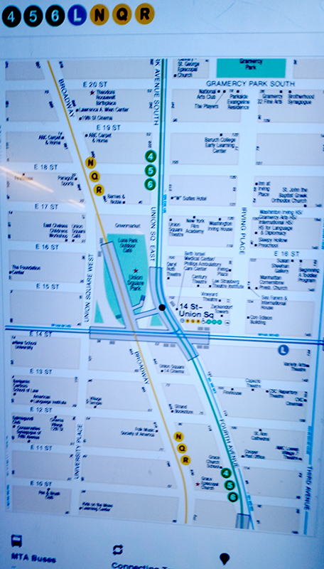
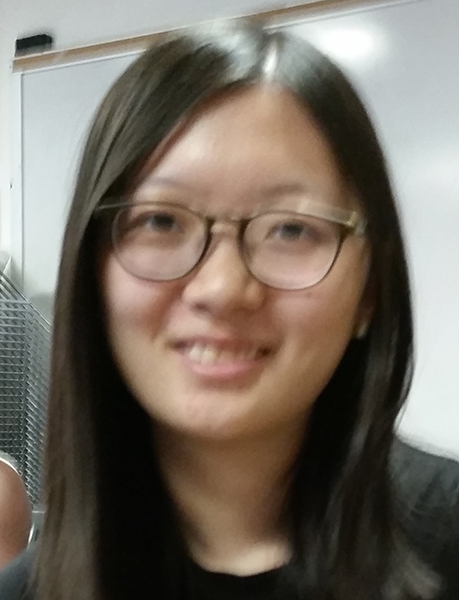
I looked through all of the available functions to see which one would give the most flexibility and ease of use, and I hit on the idea that I could use curve() like the pen tool in Photoshop, if only I could plot coordinates. So I opened my sample photo:

Ann1

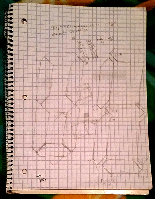
sized it to the canvas I wanted to use, and began to move the mouse to where I would normally put anchor points in Photoshop, and noted the values for x and y on a piece of paper.

I then entered them into P5 (using curveVertex()), and a picture began to emerge:

curveAttempt

but not a very compelling one. It’s amazing how difficult it is to draw by conjecture and guesswork, using only numbers and no visual interface. Even with a set of likely points, I was getting weird, lumpy, incoherent shapes, and had absolutely no meaningful way of resolving them.

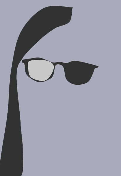
I then had a think and reread the assignment and decided that it might be more edifying to try to use the actual shapes in the program. It was still painfully slow going, but I developed a process where I decided everything (save a couple choice elements) would be simplified and symmetrical, that I would make the left feature first, “perfect” it by modifying axes, curves, etc., then copy it to the right. In looking for a way to rotate shapes I came across the translate() function, which helped immensely as I could put the center of the face at the center of my coordinate system and easily just change negatives to positives to copy elements from left to right.

But it was still mighty slow going, all trial and error and moving things five pixels at a time. It’s also amazing how  resonant the idea of a face is, and the effect of any element being “off.”
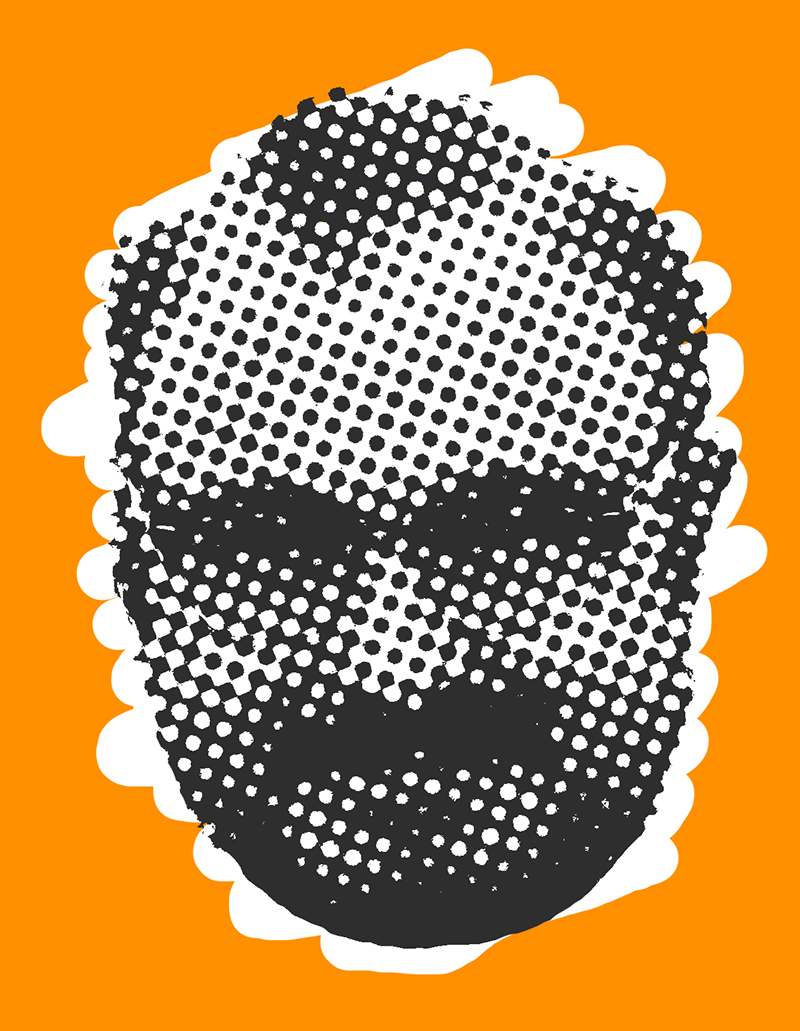
But here it is.

My code is below – there are still a couple of abandoned shapes in there, examples of things I tried that didn’t work. And there’s a very inelegant (since it repeats almost the entire code) odd-interval blinking function that I couldn’t resist throwing in.

function setup() {
createCanvas (460, 600);
}

function draw() {
background(150);

if ((second() % 5 <= 0) && (abs(sin(millis()/1000)) <= 1/4)) {
//left hair 1
fill(50);
noStroke();
translate(230, 260);
quad(-40, 200, -80, -60, -127, -60, -120, 200);
//right hair 1
fill(50);
noStroke();
quad(40, 200, 80, -60, 122, -64, 115, 200);
// face
fill(220);
stroke(0);
strokeWeight(3);
ellipse(0, 0, 214, 260);
//left temple
fill(0);
noStroke();
translate(0, 5);
quad(-115, -45, -70, -45, -70, -5, -115, -35);
//right temple
fill(0);
noStroke();
quad(115, -45, 70, -45, 70, -5, 115, -35);
//nose bridge
noFill();
stroke(0);
strokeWeight(5);
arc(0, -13, 65, 57, PI+QUARTER_PI, -QUARTER_PI);
//bottom of left lens
fill(240);
stroke(0);
strokeWeight(3);
arc(-55, -59, 90, 135, QUARTER_PI / 2, PI-(QUARTER_PI/2), OPEN);
//top of left lens
fill(240);
stroke(0);
strokeWeight(3);
arc(-55, -23, 100, 60, PI+QUARTER_PI / 2, 2 * PI-(QUARTER_PI/2), OPEN);
//bottom of right lens
fill(240);
stroke(0);
strokeWeight(3);
arc(55, -59, 90, 135, QUARTER_PI / 2, PI-(QUARTER_PI/2), OPEN);
//top of right lens
fill(240);
stroke(0);
strokeWeight(3);
arc(55, -23, 100, 60, PI+QUARTER_PI / 2, 2 * PI-(QUARTER_PI/2), OPEN);

//bottom of left eye
noFill();
stroke(0);
strokeWeight(1);
arc(-55, -38, 60, 47, QUARTER_PI / 2, PI-(QUARTER_PI/2), OPEN);
//bottom of right eye
noFill();
stroke(0);
strokeWeight(1);
arc(55, -38, 60, 47, QUARTER_PI / 2, PI-(QUARTER_PI/2), OPEN);

//bridge of nose
noFill();
stroke(160);
translate(0, 2);
strokeWeight(2);
arc(57, -27, 100, 130, HALF_PI+QUARTER_PI+QUARTER_PI/6, PI);
//left nostril
//fill(220);
//stroke(120);
//strokeWeight(2);
//arc(-20, 22, 30, 30, HALF_PI, PI, OPEN);
//right nostril
//fill(220);
//stroke(120);
//strokeWeight(2);
//arc(20, 22, 30, 30, 0, PI-HALF_PI, OPEN);
//center of nose
fill(220);
stroke(120);
strokeWeight(2);
arc(0, 18, 50, 50, QUARTER_PI/2, PI-QUARTER_PI/2, OPEN);
//mouth
noFill();
stroke(100);
strokeWeight(2);
arc(0, 15, 170, 110, QUARTER_PI, PI-QUARTER_PI, OPEN);
//lower lip
noFill;
stroke(160);
strokeWeight(1);
arc(0, 30, 170, 100, HALF_PI-QUARTER_PI/3, HALF_PI+QUARTER_PI/3, OPEN);
//left smile
noFill;
stroke(180);
strokeWeight(1);
arc(0, 55, 110, 50, PI-QUARTER_PI/3, PI, OPEN);
//right smile
noFill;
stroke(180);
strokeWeight(1);
arc(0, 55, 110, 50, 0, QUARTER_PI/3, OPEN);
//left hair
fill(50);
noStroke();
translate(-52, -108);
rotate(PI/3.35);
ellipse(0, 0, 70, 180);
translate(72, -97);
//right hair
fill(50);
noStroke();
rotate(-2*PI/3.5);
ellipse(0, 0, 50, 130);
}

else {
//left hair 1
fill(50);
noStroke();
translate(230, 260);
quad(-40, 200, -80, -60, -127, -60, -120, 200)
//right hair 1
fill(50);
noStroke();
quad(40, 200, 80, -60, 122, -64, 115, 200)
// face
fill(220);
stroke(0);
strokeWeight(3);
ellipse(0, 0, 214, 260);
//left temple
fill(0);
noStroke();
translate(0, 5);
quad(-115, -45, -70, -45, -70, -5, -115, -35);
//right temple
fill(0);
noStroke();
quad(115, -45, 70, -45, 70, -5, 115, -35);
//nose bridge
noFill();
stroke(0);
strokeWeight(5);
arc(0, -13, 65, 57, PI+QUARTER_PI, -QUARTER_PI);
//bottom of left lens
fill(240);
stroke(0);
strokeWeight(3);
arc(-55, -59, 90, 135, QUARTER_PI / 2, PI-(QUARTER_PI/2), OPEN);
//top of left lens
fill(240);
stroke(0);
strokeWeight(3);
arc(-55, -23, 100, 60, PI+QUARTER_PI / 2, 2 * PI-(QUARTER_PI/2), OPEN);
//bottom of right lens
fill(240);
stroke(0);
strokeWeight(3);
arc(55, -59, 90, 135, QUARTER_PI / 2, PI-(QUARTER_PI/2), OPEN);
//top of right lens
fill(240);
stroke(0);
strokeWeight(3);
arc(55, -23, 100, 60, PI+QUARTER_PI / 2, 2 * PI-(QUARTER_PI/2), OPEN);
//top of left eye
fill(255);
stroke(0);
strokeWeight(1);
arc(-55, -15, 60, 47, PI+QUARTER_PI / 2, 2 * PI-(QUARTER_PI/2), OPEN);
//bottom of left eye
fill(255);
stroke(0);
strokeWeight(1);
arc(-55, -38, 60, 47, QUARTER_PI / 2, PI-(QUARTER_PI/2), OPEN);
//center of left eye
fill(0);
noStroke();
ellipse(-55, -26, 20, 20);
//top of right eye
fill(255);
stroke(0);
strokeWeight(1);
arc(55, -15, 60, 47, PI+QUARTER_PI / 2, 2 * PI-(QUARTER_PI/2), OPEN);
//bottom of right eye
fill(255);
stroke(0);
strokeWeight(1);
arc(55, -38, 60, 47, QUARTER_PI / 2, PI-(QUARTER_PI/2), OPEN);
//center of right eye
fill(0);
noStroke();
ellipse(55, -26, 20, 20);
//bridge of nose
noFill();
stroke(160);
translate(0, 2);
strokeWeight(2);
arc(57, -27, 100, 130, HALF_PI+QUARTER_PI+QUARTER_PI/6, PI);
//left nostril
//fill(220);
//stroke(120);
//strokeWeight(2);
//arc(-20, 22, 30, 30, HALF_PI, PI, OPEN);
//right nostril
//fill(220);
//stroke(120);
//strokeWeight(2);
//arc(20, 22, 30, 30, 0, PI-HALF_PI, OPEN);
//center of nose
fill(220);
stroke(120);
strokeWeight(2);
arc(0, 18, 50, 50, QUARTER_PI/2, PI-QUARTER_PI/2, OPEN);
//mouth
noFill();
stroke(100);
strokeWeight(2);
arc(0, 15, 170, 110, QUARTER_PI, PI-QUARTER_PI, OPEN);
//lower lip
noFill;
stroke(160);
strokeWeight(1);
arc(0, 30, 170, 100, HALF_PI-QUARTER_PI/3, HALF_PI+QUARTER_PI/3, OPEN);
//left smile
noFill;
stroke(180);
strokeWeight(1);
arc(0, 55, 110, 50, PI-QUARTER_PI/3, PI, OPEN);
//right smile
noFill;
stroke(180);
strokeWeight(1);
arc(0, 55, 110, 50, 0, QUARTER_PI/3, OPEN);
//left hair
fill(50);
noStroke();
translate(-52, -108);
rotate(PI/3.35);
ellipse(0, 0, 70, 180);
translate(72, -97);
//right hair
fill(50);
noStroke();
rotate(-2*PI/3.5);
ellipse(0, 0, 50, 130);
}

Thoughts on Interactivity and Unknown Knowns

As I’ve gone though my first week at ITP, I keep returning to Slavoj Zizek’s critique of the philosophy of Donald Rumsfeld. Rumsfeld states that, in the leadup to the war, we were faced with known knowns (things we know we know), known unknowns (things we know we don’t know) and unknown unknowns (things we don’t even know that we don’t know), where presumably the real danger lies. Zizek points out that he misses the logical fourth state, which would be “unknown knowns.”

In Zizek’s reading, the “unknown knowns” are suppositions, tendencies, reactions and practices that are not acknowledged or scrutinized (hence “unknown”) but which are integrally part of our operations (“known” in the sense of fixed/assured and not subject to change). It creates a picture of an actor who presumes he is working from a defined set of parameters to create an ostensibly predictable outcome, while he is in fact working with some other parameters which he neither acknowledges nor understands, but which nevertheless affect the outcome and render it unpredictable, in Rumsfeld’s case catastrophically so.

I feel like this dovetails quite handily into discussions of interactivity. As a complete amateur, I see building interactivity as the process of determining how a person enters parameters to affect the outcome of an event, which is then in turn edifying, entertaining or in some sense meaningful to the person. Our job as designers is both to come up with the skeleton of an interaction (desire -> process -> result) and figure out how to allow the participant to “create” that interaction for him- or herself.

Code on a screen is terribly appealing because, in its stripped-down form, it ostensibly allows the programmer total control over what goes into an event, the processes that take place within it, and the output/result. By limiting operations to strictly defined and digitally enforced mathematical operations, it presumes to get rid of both the unknown unknowns and unknown knowns (though of course, that’s an illusion too, as anyone who has ever used buggy software can attest).

But when we begin to deal with devices that will accept input from the physical world, we encounter these other problems, a giant host of unknown unknowns and unknown knowns on every level, which are paradoxically the most difficult and the most exciting aspect of interactivity. From the environment (ambient light, temperature, background noise/vibration) to the psychology of the user (what does he expect from this machine? what does she want that tool to do? is that a natural motion for someone who wants that outcome?), devices that draw on physical cues need to be intuitive and flexible to process both things that the machine is not expecting and things that the user doesn’t realize are happening.

And they can also play with this background of unconscious operation to illuminate things that have never been shown before. How many people ten years ago realized how many steps they took in a day, or what their resting heart rate was, vs. now?

But at the same time, how does a human use this information? Ten years ago, I never had to worry over how many steps I took in a day – what does it mean to me? What should it mean to me? I was always taking steps and my heart was always beating at some non-zero rate – what good does it do me to know the figures?

As we progress into a world of intensive data surrounding every aspect of our lives, we will begin to need mental/spiritual cleaning systems that order and organize the cacophony and help us to forget things. In some sense, it’s a shift from addressing diseases of privation to diseases of plenty.

Turning to the readings, I was struck by how different the world is now from the world Crawford describes in his article – amazing to see how through-the-looking-glass we’ve gone in only a dozen years. He speaks dismissively of the unthinkable case of “Nintendo Refrigerators” and yet we now have refrigerators with screens in them, refrigerators that can become freezers at the touch of a button, ovens that refrigerate your food all day until they start baking it in the afternoon…

I am intrigued by his model of a device acting as a participant, which listens, thinks and returns a new stimulus to the other participant, as the definition of interaction. It’s a good one, though in contrasting it with a non-interactive book or painting, Crawford credits the program/process/device itself (which can listen and respond) rather than the human creator or creators of the program (who can’t), as “thinking,” which is sort of a dangerous assumption. I suppose on a deeper level of interactivity (and one that we’re coming ever-closer to) the “thinking” can itself be defined by the user/participant, though that risks becoming something like a funhouse mirror.

But I guess I’ve also been thinking about a technological interaction as exclusively being between a single human participant and a nonhuman device or series of devices, which is flawed. There are of course interactions with multiple human participants, in which the device is there to modulate the contact between them. And this is obviously the lion’s share of the interactivity we see today.

The Rant is brilliant, so brilliant that I don’t have much to say about it. I think that “things your hands know” (as opposed to “things your eyes know”) defines a huge and meaningful subset of the “unknown knowns,” and probably the ones that are the most fun and rewarding to dig out and play with. Of course, the challenge it posits is how to create physical, hand-knowable inputs that are as mutable as points of light on a screen, but that’s the challenge we need to take up. And maybe mutability isn’t the be-all and end-all of design. Maybe there is a place for old-fashioned permanence in the world of Things.